The future of UI design is in the cards
By Dennis Clemente
The future of UI design is in the cards
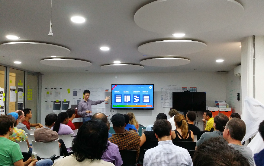
That’s the prognostication of lively and dynamic speaker Christopher Tse who is inviting people to stage a counterculture revolution in UI design. “Rather than Silicon Valley (leading it), let it be New York this time,” he implored his audience at the NYC UX Acrobatics meetup at Amplify in DUMBO, Brooklyn last July 8.
Titled “Patterns of Card User Interface Design,” Tse’s talk started with an overview first of how designers have tapped card-based UI to present units of content responsively across a wide range of mobile devices and screen sizes. “We see this with Twitter cards, Google Now cards, Passbook passes, Pinterest tiles, Facebook Paper.”
When done right, Tse said a card can look like a responsive web content, work like a focused mobile app, and feel like a saved file that you can share and reuse.
“As these “cards” become more interactive, they go from being just concentrated bits of content and turn into mini-apps that can be embedded, capture and manipulate data, or even process transactions,” he said.
“If you look more deeply into the current state of card-based UI, you can see that cards are growing out of just concentrated bits of content and are turning into mini-apps that can be embedded, capture data, and drive actions,” he added.
Thinking about how playing cards carry information in digestible form should give you the idea. To put playing cards in place, you need a container. In Card UI design, a container can be a narrative, to help tell a story, a conversation or workflow, or a discovery channel the way Facebook and Pinterest rounds us up.
What needs exploring is the architecture beneath the cards. “This is to see whether cards built on the foundation of HTM5, CSS3, and modern Javascript, can re-inject the ethos of the Open Web back into mobile development and turn back the tide against proprietary platform lock-ins and app silos,” Tse said.
How is Tse planning his counterculture revolution n UI design?
Recent announcements from Google around the unification of their UIs using Material Design and from Apple about notifications widgets in iOS 8 show that that the big players are also firmly behind this new UI trend.
Saikiran Yerram, a veteran software developer/designer, showed a prototype of a card-based playlist app, created using Google’s Material Design guidelines, bringing multiple web-based educational tools into one unified learning experience.
Perhaps the best way to promote Card UI design is to find people who work in government, policy-makers or those in non-profit organizations, according to Tse who is clearly on a mission to democratize his ideas. Addressing the audience, Tse said, “Let me know if you know anyone.”
